Experiments comparison
Overview
If you want to compare the results and the quality of the experiments if you are:
- In the dashboard.
- In the statistics tab.
The procedure is:
- In the Experiments panel, select Compare experiments results
 .
. -
Select the experiments you want to compare.
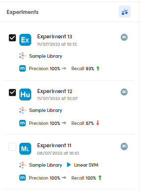
The selected experiments are also displayed in the upper toolbar.

- Select the down arrow
 to open the experiment drop-down menus and choose the experiments to be compared.
 - Select Swap runs
 to swap the experiments and change the experiment in focus, the one on the right (only when comparing two experiments).
 - Select Close to stop the comparison and view the experiments dashboard.
Info
It is possible to compare experiments performed with different engine types.
Depending on the number of experiments selected, the display mode changes.
Compare two experiments
If you compare two experiments the Statistics • Preferred metrics tab and the Models tab are displayed.
Note
The tab label Statistics • Preferred metrics depends on the preferred metrics set in the project settings.
For example, if you selected Sample average, the tab label has the following format:
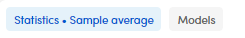
Statistics • Preferred metrics
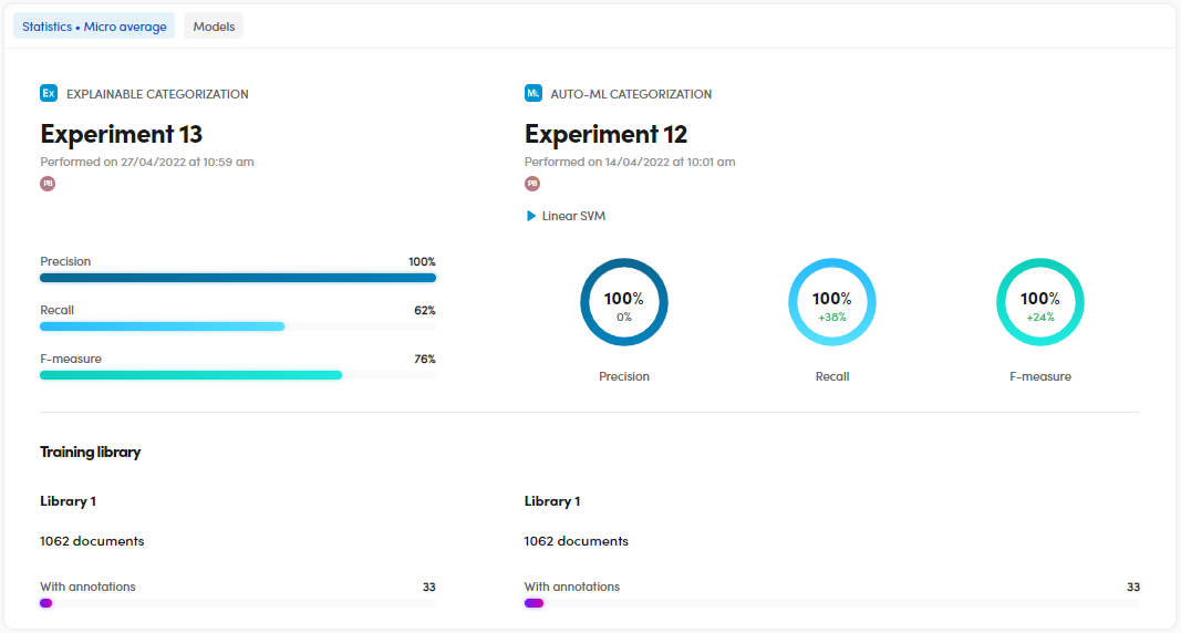
The Statistics • Preferred metrics tab displays the model types, the experiments names, date, time and author.
Compare the quality indicators
To compare the quality indicators, check the Precision, Recall and F-measure charts.
You can also check the differences in percentage (delta) between the two experiments.
Compare the training library
To compare the training library in terms of number of documents with annotations, check the Training library area.
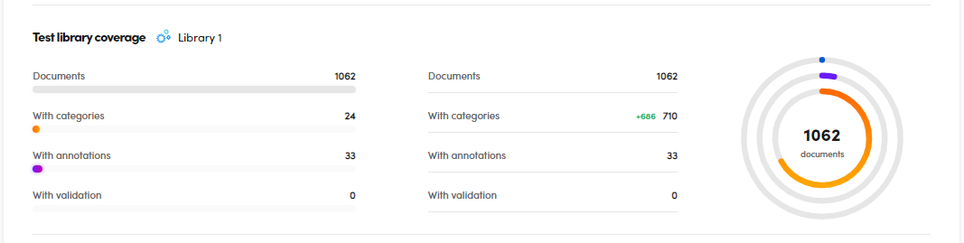
Compare the test library coverage
To compare the test library coverage, check the charts in the Test library coverage area.
You can check the differences in terms of documents, documents with categories, with annotations and with validation.
You can also check the differences in percentage (delta).
Compare the recognized categories
To compare the categories recognized in the two experiments, check the Extracted categories lists and charts in the Resources area.
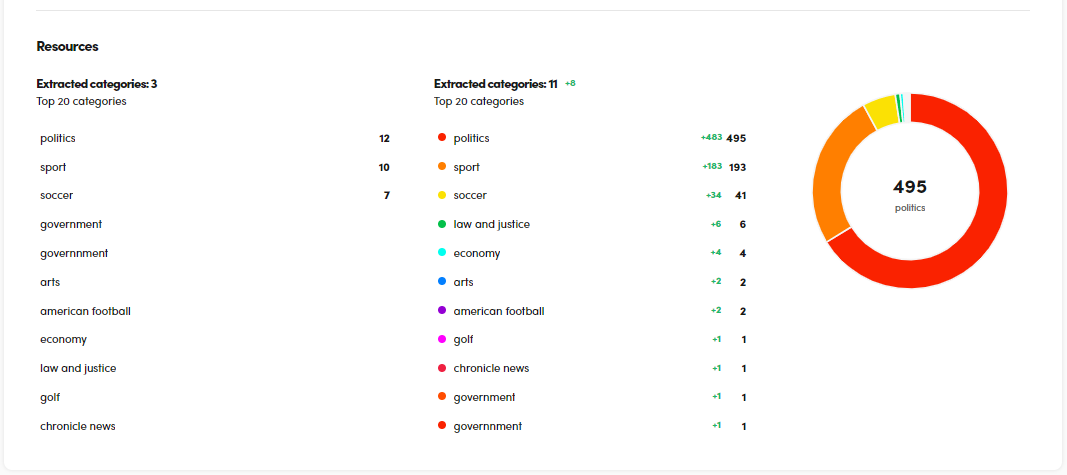
You can also check the differences in percentage (delta) between the two experiments.
- Hover over the category of interest and select Search
 to search for a set of documents categorized with that category. This action displays the Documents statistics tab.
 - Hover over the category of interest and select Show in resources
 to view the Resources tab with the category in focus.
 - Hover over the category of interest and select Show information
 to display information about it.
Statistics about the two experiments in comparison
-
Select Browse documents
 to check data and statistics related to the experiment in focus (the one on the right in the upper toolbar).
 -
To check the hits numbers of the experiment in focus, see the Taxonomy panel on the right. Each category may be preceded by green or red numbers indicating respectively gained and lost hits.
- To check the categories status of the listed documents, see the related chips and formats:
- Green, if the category is a true positive.
- Red, if the category is a false positive.
- Bold, if the category did not exist in the taxonomy of the previous experiment, but does in the current one.
- No color, if the category exists in both experiments.
- Gray, if the category does not exist in the current experiment, but did in the previous one.
Note
The + or - signs indicate gained and lost categories in a document.
- Select Analytics
 to display the Statistics • Preferred metrics tab.
Open a document in detail view
- Select View document
 to display the detail view.
 - Select Browse documents to check data and statistics related to the experiment in focus (the one on the right in the upper toolbar).
The Taxonomy panel in the detail view, on the right side, has two sub-panels:
- Changes
- Tree
The Tree sub-panel represents the taxonomy as just described above, while the Changes sub-panel is composed of these items:
- In
- Out
- Won
- Lost
In and Out represent respectively gained and lost categories from the taxonomy among the two experiments. As you can see, they're differentiated by a different style.
Out categories can be of different typologies based on the color of their chips:
| False positive | False negative | True positive |
|---|---|---|
 |
 |
 |
Won and Lost represent respectively categories that turned into true positives and categories that from true positives turned into false positives or false negatives (the latter case when comparing two experiments focusing on the least recent one).
| Won | Lost |
|---|---|
 |
 |
The colors logic for the chips is the same described for Out categories above. The blue chip states that the category turned from a false negative into a true positive. The green chip states that the category turned from a true positive into a false negative.
Select Analytics to display the Statistics • Preferred metrics tab.
Resources about the experiment in comparison
Select Show resources  to display the resources about the two experiments in comparison.
The data you see refer to the experiment on the right—with the focus on a selected category—in comparison with the other one.

- Select Browse documents to check data and statistics related to the experiment in focus (the one on the right in the upper toolbar).
- Select Analytics to display the Statistics • Preferred metrics tab.
Left panel
The panel on the left is composed by several sub-panels:
- All categories
- In
- Out
- Changes
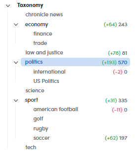
All categories
The hits for some of the taxonomy nodes are shown in case of variations between the two compared experiments.
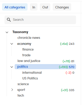
In the example picture, the green number states states that the Politics category has gained 193 hits in the experiment in focus in comparison with the other one.
The red number states the opposite: the International category has lost one hit in comparison with the other experiment.
Note
When you don't see any number, no progression or regression has occurred for the category.
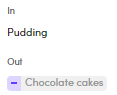
In and Out
The In sub-panel shows the categories that gained more hits in comparison with the previous experiment, while the Out sub-panel shows the categories that lost hits.
| In | Out |
|---|---|
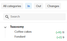 |
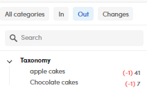 |
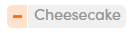
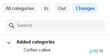
Changes
The Changes sub-panel shows the added categories: in this case, the category Coffee cakes did not exist in the Experiment 2, but it was added in the next experiment (the one in focus).
Right panel
The right panel shows the data related to the category in focus selected from the taxonomy in the All categories sub-panel.
For each category you can see:
- The ID
- A recap row for the selected category
- The list of documents where the category occurred
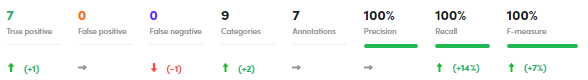
Summary row
This row shows for the selected category in the experiment in focus:
- The number of True positive.
- The number of False positive.
- The number of False negative.
- The number of occurrences of the item in Categories.
- The number of occurrences of the item in Annotations.
- The category metrics.
The arrows with the numbers indicate for each item of the recap row:
- Progression

- Regression

- Stability

Note
The numbers indicate gains or losses of hits according to their colors.
Document list
Each row of the list contains:
- Document Title
- Value
- Cat. (number of categories)
- Ann. (Number of annotations)
- TP (True Positive)
- FP (False Positive)
- FN (False Negative)
- Precision
- Recall
- F-Measure
The Value column shows what kind of transaction occurred for the category in focus comparing the previous experiment with the current one.
Example
 : the category turned from a false negative in the previous experiment into a true positive with the most recent experiment.
 : the category was not spotted in the previous experiment, but it turned into a false positive with the most recent experiment.
 : the category turned from a false positive in the previous experiment into a true positive with the most recent experiment.
Select the right arrow  and the down arrow to expand and collapse the single document and view its categories.
The categories can have different fonts:
- Green, if the category is a true positive.
- Orange, if the category is a false positive.
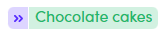
- Bold, if the category is a new one that did not exist in the previous experiment.
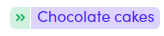
- Normal font, if the category exists in both the experiments.
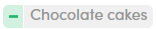
- Grayed, if the category does not exist in the current experiment, but did in the previous one.
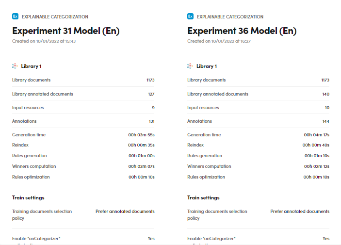
Models
The Models tab—beside the Statistics • Preferred metrics—tab compares the two models of the experiments and displays a list of data:
- The experiments models
- Creation date and time
- The experiments names
- Information about the libraries used
- The train settings of the experiments
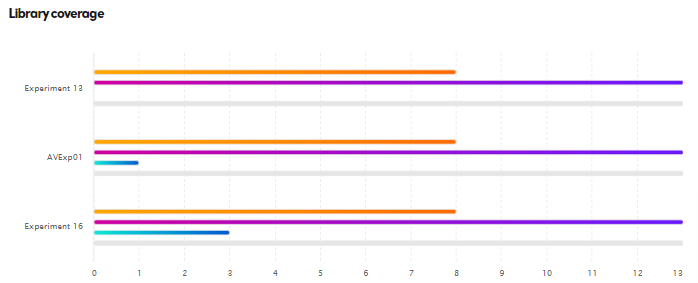
Compare three or four experiments
If you compare three or four experiments, only the Statistics • Preferred metrics panel is displayed and the visual representation of the upper part will be the same of the Dashboard panel.
The lower part is about library coverage and looks different from the comparison of two experiments.
To compare the library coverage, in the lower panel part, check the charts under Library coverage:
- Hover over the orange line to know the number of documents with categories.
- Hover over the violet line to know the number of documents with annotations.
- Hover over the turquoise line to know the number of validated documents.
- Hover over the gray line to know the total number of documents.
Compare more than four experiments
In case of more than four experiments, only the Statistics • Preferred metrics panel is displayed and the display has the same form of the dashboard panel.