Edit a workflow
The canvas
A workflow is designed in the Editor tab inside the workflow's workspace, which opens at the end of the creation wizard or when opening an existing workflow from the Workflows view of the main dashboard.
The central part of the editor is a canvas: the workflow corresponds to the components you place—and possibly connect—inside the canvas.
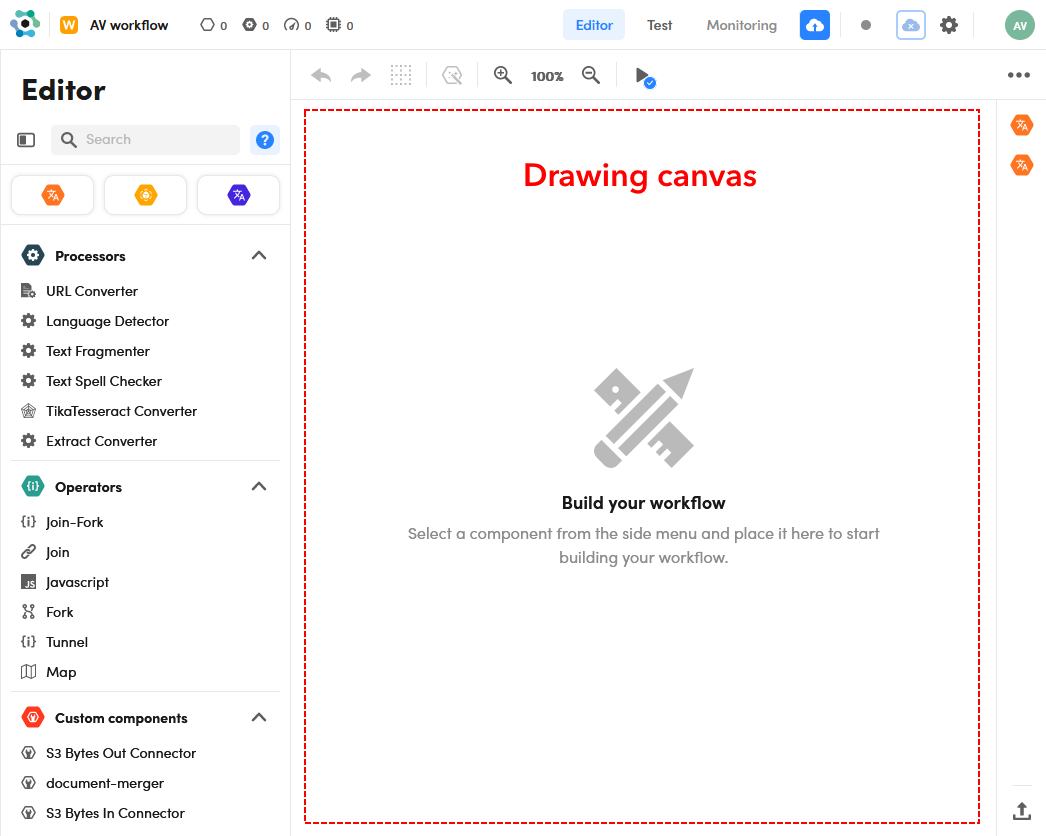
The canvas contains an hexagonal grid that reveals itself when you hover over it as you add or move blocks. All the building blocks of the workflow snap to this grid.
Components
The components shown in the left panel and in the vertical bar on the right side of the page (My Models) can become building blocks of the workflow.
Components are:
- Models: can be symbolic models, ML models or knowledge models. Symbolic and ML models are NLU models that have been previously published from the Platform's authoring application or uploaded in NL Flow.
- Processors: perform utility tasks like extracting text from a file.
- Operators: can be used to create complex flows of data between blocks or to process flow data with JavaScript.
- Custom components: optional and installation-specific software modules.
Component guide
For usage help on the processors listed in the left panel, select the question mark icon at the top of the panel  .
.
After that, if you hover over a processor in the list, a component guide appears on the right containing the description of the component, an Input tab which lists the top-level keys of the input JSON, an Output tab which lists the top-level keys of the output JSON and possibly a Functional tab listing the functional parameters that can be checked and modified when editing a workflow block corresponding to the component.
To disable component guides, select the question mark icon again.
Data flows
A workflow is made of one or more data flows: in a flow, each block receives input data, possibly processes it to produce new o different data and then makes its output available to downstream blocks.
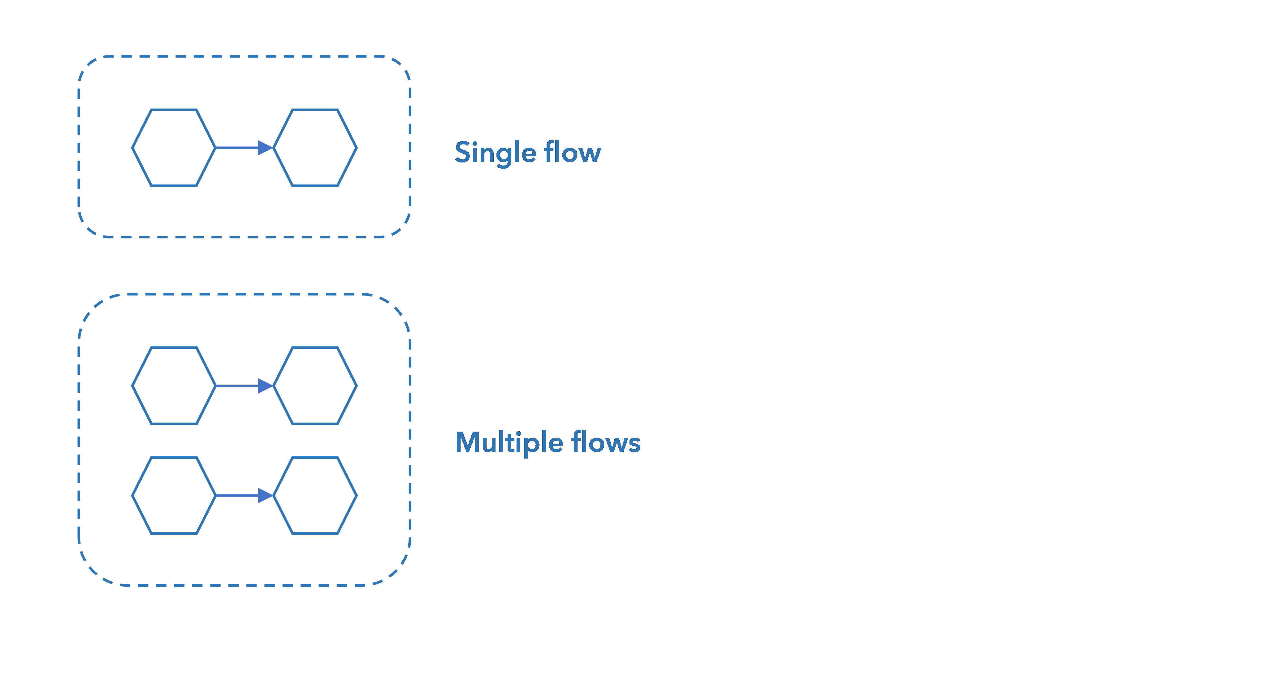
A data flow can be a single block or multiple connected blocks.
When the workflow is used—fore example via the NL Flow API—, each data flow is evaluated from left to right: the input request enters the workflow and is submitted to the leftmost block of each data flow. The output of each data flow is that of its rightmost block. The overall output of the workflow is the concatenation of the outputs of all the data flows.
Given the direction of the data flow, when multiple blocks are needed they must be laid down from left to right.
Add blocks
To add a block to the workflow:
-
To add a processor, an operator or a custom component:
- Select the component on the left panel.
- Move the corresponding block to the desired position on the canvas.
- Click to drop the block in place.
Or:
- Drag the component to desired position on the canvas.
-
To add a model:
-
Select the model type on the strip at the top of the components' list in the left panel, choosing between:
-
Move the frame of the model type to the desired position on the canvas.

-
Click to drop the frame in place.
-
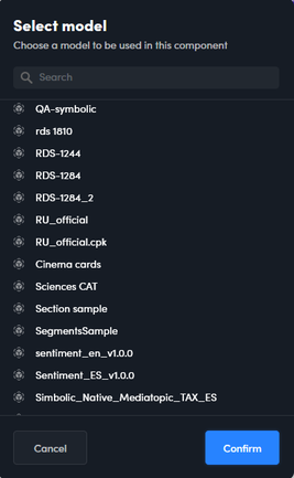
Select the model from the pop-up.
When you choose a ML model type, the pop-up contains the Advanced mode toggle switch and models based on old version 2.0 of ML technology are differentiated in the list.
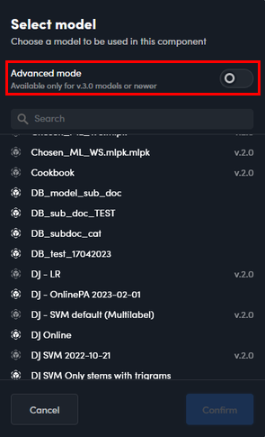
If Advanced mode is on and you choose a model based on a recent version of the ML technology, the corresponding block will not include the symbolic engine. This kind of block will only execute the ML algorithm, skipping the preliminary text analysis and feature extraction step that ML models usually perform.
You can also use the search box inside the pop-up to find the model: enter characters in the box to list only models with matching names.
Or:
- Select the model from the My Models bar on the right side of the page.
- Move the corresponding block to the desired position on the canvas.
- Click to drop the block in place.
Or:
- Drag a model from the My Models bar to desired position on the canvas.
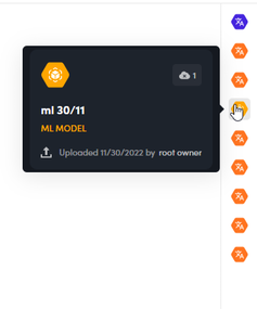
To know about a model listed in the My Models bar, hover over its icon.
-


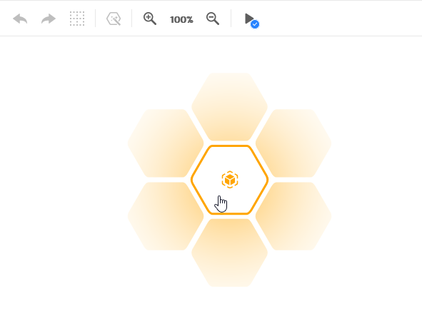
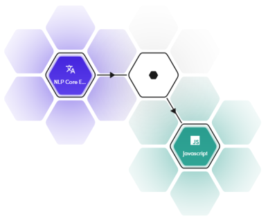
The relative position of a block with respect to the previous, in order to be connected to it, must be chosen between those indicated with the gray hexagon in the following picture.

You cannot put a block adjacent to another.

Get block information
Any block
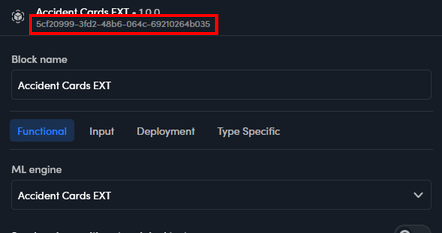
To see the full name of a block and the component version:
-
Hover over the component block in the diagram. A tooltip appears showing the block name and the component version.
Or:
-
Edit the block. Block name and component version appear at the top of the pop-up.

The block name also appears in a text box and is one of the block properties that can be edited.
Each block of a workflow has a unique identification code. This code appears in multi-flow workflow output and in case of verbose output. Read more about this topic in the article dedicated to workflow output.
To find the identification code of a block, edit the block. The code appears at the top of the pop-up below the block name.
Model blocks
Model blocks have additional information that can be useful for troubleshooting and learning more about what they do and their output.
For more information on model blocks:
- Select the model block.
- Select Show resources
 on the canvas toolbar.
Or:
- Right-click the model block and choose Show resources
 on the context menu.
A pop-up appears on the left of the page. It always contains the Info tab. For symbolic models based on a fairly recent version of NL Core, more tabs are available.
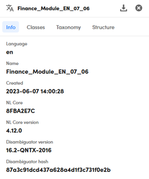
At the top of the pop-up is the model name.
The Info tab shows the supported language, the creation date and detailed info on the technological components on which the model is based.
In the Classes tab, when present, the information classes that the model can extract are listed.

Classes are divided into groups. Next to the name of each group is the number of classes it contains. To collapse and expand a group select the arrow icon to the left of the group name.
The Taxonomy tab, when present, shows the category tree.
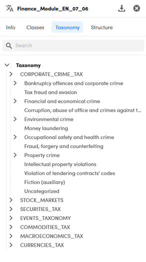
To expand and collapse tree nodes:
- Use the arrows to the left of the node name.
Or:
- Select Expand node
 or Collapse node
  to the right of the category name.
In the Structure tab, when present, any defined sections and segments are listed.
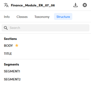
The presence of sections can imply that the model is able to accept and exploit, for the purpose of categorization or extraction, an input text divided into sections.
The definition of segments, on the other hand, indicates that the model can identify segments of text with particular characteristics and use them as the scope of the categorization or extraction rules.
Specified input sections and detected segments can also be part of the model output.
In the Classes, Taxonomy and Structure tabs there is a search box. To filter the list in the tab, type one or more characters in the box and press Enter. To cancel the filter select the X icon  .
.
To export all the model information in a JSON file, select Export  .
.
To close the information pop-up select Close  .
.
Pan and zoom
To pan the diagram, drag the canvas.
To recenter the diagram in the canvas when is partially or fully panned out of sight, select Recenter  in the lower right corner of the canvas.
To zoom in and out, select Zoom in  or Zoom out
  on the canvas toolbar or use the mouse wheel.
Move blocks
To move a block, select it in the canvas then:
- Right-click the block and select Move selected component
 on the context menu.
 - Move the block to the new position.
- Click to drop the block in place.
Or:
- Select the block.
- Select Move selected component
 on the canvas toolbar.
 - Move the block to the new position.
- Click to drop the block in place.
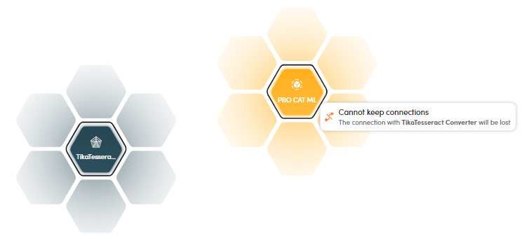
If you move a block too far from a block is was connected to, a notification warns you that the connection will be lost.
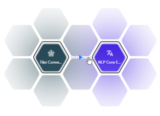
Connect blocks
Two blocks can be connected if their relative positions allows for the creation of a data flow between them.
To connect two blocks:
- Right-click the first block and select Connect selected component
 on the context menu, then select the second block.
Or:
- Select the first block.
- Select Connect selected component
 on the canvas toolbar.
 - Select the second block.
If the block are as close as possible, you can also connect them by simply selecting the segment between the two hexagons.
Arrows in connections help remind the direction of the data flow, from left to right.
When connecting two blocks, the editor tries to automatically carry out input mapping.
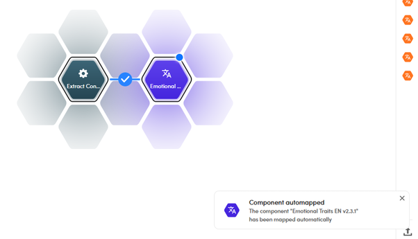
When automatic mapping is not possible, a dashed line is drawn around the right block and a warning message is displayed.
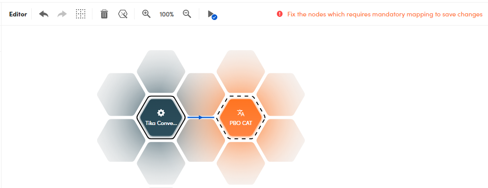
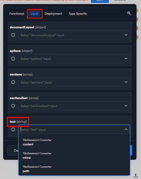
To check the result of automatic mapping or carry out mapping by hand, edit the right block (see below) and go to the Input tab.

In the image above you can see the result key of the Extract Converter block output JSON was automatically mapped to the documentLayout input key of the Business Events EN block.
Input mapping
Each workflow block receives a JSON input—either from the workflow inlet or from the previous block—and emits a JSON output.
The block "knows" which parts of the input JSON it must or can consider, for example:
- A model block, based on its type, recognizes one or more top-level keys (for example a string named
text) present in the input JSON. - An operator block like Join just takes the input JSON and propagates it, unaltered, to its output.
Sometimes, however, the keys that the block needs are apparently absent from its input:
- They can indeed be there, but named differently.
- The block that is placed deep in the workflow and needs data from the workflow inlet or from an upstream block that is not immediately preceding it.
In these cases, input mapping is needed. Input mapping is "telling" a block where to take the keys that it recognizes if they are not present in its direct input or have non matching names.
In the reference section of this manual you will find the description of the JSON keys that model blocks and processor blocks recognize in their input.
Operator blocks accept any input.
Input mapping is either carried out "automagically" when connecting blocks or done by editing the block and setting the fields of the Input tab, which can be done by hand or with the help of an assistant.
Info
Mapped keys must be of the same type (e.g., an object must be mapped to an object, an array to an array, a string to a string).
Edit a block
In the reference section of this manual you will find the description of the editable properties for model blocks, processor blocks and operator blocks.
To edit a block:
- Double-click the block.
Or:
- Right-click the block and select Edit component
 on the context menu.
Or:
- Select the block, then select Edit component
 on the canvas toolbar.
The edit dialog is displayed.
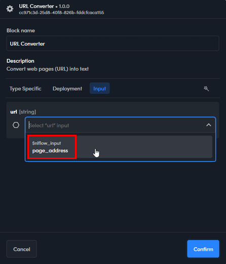
For model and processor blocks, use the Input tab to check or set input mapping when needed.
The Input tab contains fields, each with a drop down list, corresponding to the keys that the block recognizes in the input JSON. One or more fields need to be set when input mapping is necessary.
You can find one or more fields already set the first time you open the tab if automagic input mapping was carried out successfully when you connected the block to another.
If automagic input mapping was not possible, you can get suggested mapping by selecting Map properties automatically  .
.
If even this doesn't work or you want to change or enrich the mapping, select from values from the drop down lists of the fields. If you type inside a field, only matching output keys are listed.
The values staring with $nlflow_input correspond to keys of the workflow's input, if it was formally defined.
Disconnect blocks
To remove the connection between two blocks, select it and:
- Press
Del.
Or:
- Select Delete selected component
 on the canvas toolbar.
Warning
Disconnected blocks are still a valid workflow made of independent flows.
Remove blocks
To remove a block:
- Select it.
- Press
Del.
Or:
- Right-click and select Delete selected component
 on the context menu.
Or:
- Select it.
- Select Delete selected component on the canvas toolbar.
Info
When you remove a block, all its inbound and outbound connections are deleted.
Replace model blocks
To replace a model with another model of the same type:
- Right-click the model block and select Replace component
 on the context menu.
Or:
- Select the model block inside the canvas.
- Select Replace component
 on the canvas toolbar.
The Replace component dialog is displayed.

Select the new model from the drop-down list, then select Replace.
Undo and redo changes
Select Undo  or Redo
  on the canvas toolbar to undo or redo changes.
Clear the canvas
To clear the canvas, select Clear workflow  on the drawing area toolbar.
Optimize layout
To optimize the layout of complex workflows select Optimize layout  on the canvas toolbar.
The editor will automatically rearrange the blocks so that the layout is as compact as possible.
Validate the workflow
A workflow is invalid if it contains inconsistencies, such as a join block without at least two inbound connections or a fork block without at least two outbound connections.
To validate the workflow, select Validate current workflow  on the canvas toolbar.
If validation fails, the Validate current workflow icon shows a red alert sign  and the Validation failed dialog is displayed. Expand Show detail to know more about errors.

Track and save changes
The changes made since the last save are listed in the drop-down on the canvas toolbar.

Changes are also visualized with blue dots and blue outlines inside the diagram.

To save changes, select Save on the canvas toolbar.
To discard changes, select Discard on the canvas toolbar.
Workflow information
Size and computing resources
Information about the size of the workflow and the computing resources it requires when published is shown in the main toolbar next to the workflow name.

 : the number after the hollow hexagon icon is the number of blocks.
 : the number after the icon of an hexagon with a gear inside is the number of Javascript blocks.
 : the number after the gauge icon is the number of CPUs needed to publish the workflow ("m" stands for "milli").
 : the number after the chip icon is the amount of RAM needed to publish the workflow, expressed in mibibytes or gibibytes.
The NL Flow runtime must have sufficient computing resources to publish the workflow: find more information about this in the description of the Runtime view of the main dashboard of the NL Flow app.
When a workflow has been published, numbers in parenthesis refer to the saved version of the workflow and are displayed if they differ from the published workflow.

Identifying information
Each workflow has a unique identification code. This data is part of the endpoints (URL) of the resources corresponding to the workflow in the NL Flow API, endpoints that allow programmers to use the workflow to analyze documents or know its status, if the workflow has been published.
To view the identifying information select Workflow settings  of the main toolbar, then select the Information tab in the dialog.
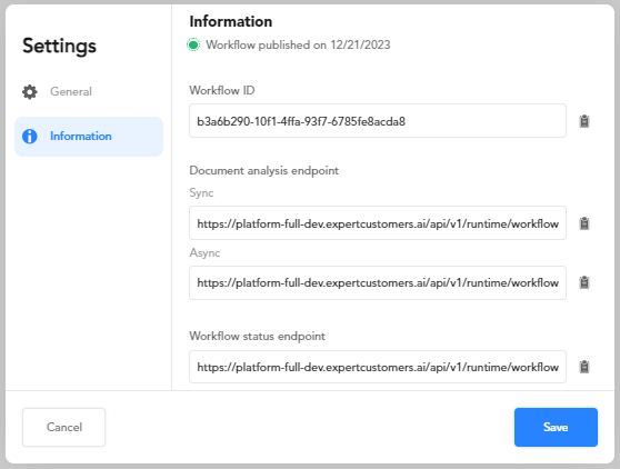
Here you can find the workflow ID, the API endpoints for analyzing documents, the API endpoint for determining the status of the workflow and the number of API key linked to the workflow.
Info
To manage API keys and link them to workflows, use the Runtime view of the main dashboard of the NL Flow app.
To copy information to the clipboard select the button  to the right of the field.
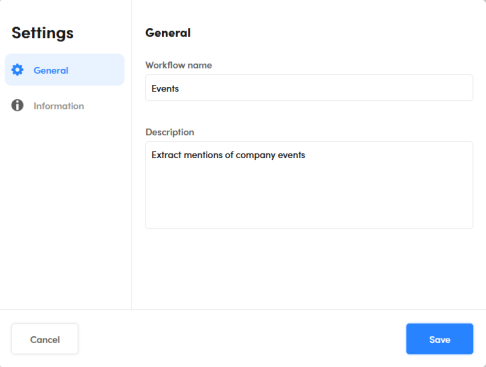
Change workflow name and description
To change the name or the description of the workflow:
- Select Workflow settings on the main toolbar.
- Select the General tab.
- Change information.
- Select Save.
Define the input format
When:
- The are multiple data flows starting with blocks of different types (for example a URL Converter processor and a TikaTesseract Converter processor) and the input to the workflow must be "split" between the starting blocks.
Or:
- The workflow input JSON has top-level properties that conceptually correspond to the input properties of some workflow blocks, but with different names.
the formal definition of the workflow input allows specifying the name and the type of the top level keys of the workflow's input JSON so that they can be mapped to the input of workflow blocks—no matter their position in the flow—by editing the block and setting the fields of the Input tab to the keys of the $nlflow_input pseudo block.
In the reference section of this manual you will find the description of the input properties for models and processors.
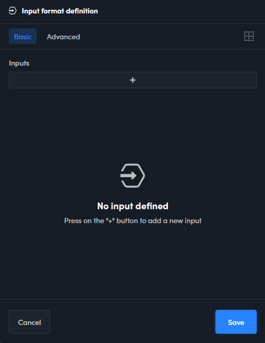
To define the workflow input format, select the ellipsis  then Input format definition. The Input format definition window appears.
Use the Basic tab to define the format interactively. In input format definition, inputs correspond to top level properties of the workflow's input JSON.
- To define a new input, select the plus button
 . A couple of boxes appears below the list. Enter the name of the new input in the left box and click elsewhere, then select the type from the drop-down box on the right.
 - To modify an input change its name and/or type.
- To delete an input select it and then select Delete
 .
.

Alternatively, use the text editor in Advanced tab to define the format by writing a JSON template.

The entire template must be enclosed in curly braces. The syntax of the definition for a input is:
"name": type
where name is the name of the input. type represents the type of the key and can be:
{}for an object[]for an array""for a string0for a numberfalsefor a boolean
Use the comma , to separate multiple inputs.
To delete all the inputs select Clear text  .
.
To save the definition select Save.
Publish the workflow
To publish the workflow:
-
Select Publish
 on the main toolbar. The publishing wizard starts.
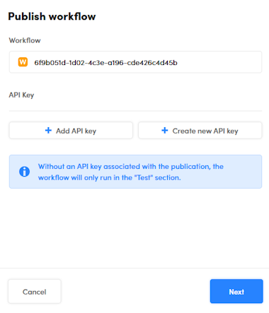
It is not mandatory to link API keys to the workflow, but a published workflow without a linked API key cannot be used with the NL Flow API, in can only be interactively tested in the Test tab. Find more information about API keys and how to manage them in the description of the Runtime view of the main dashboard.
-
To add a link to an API key:
- Select Add API key: a new drop-down list appears.
- Select the key from the new drop-down list. Repeat from the previous step to link more keys.
-
To remove the link with an API key, select Remove
to the right of the key. -
To change a linked key, click its name. All API keys whose name contains that of the pre-selected key will be shown in a drop-down list, with the current key marked with a check mark.
- To view additional keys, edit the key name: all keys whose name contains what you type will be listed. If you remove all characters, all the API keys will be listed.
- To choose another key, select it from the list.
-
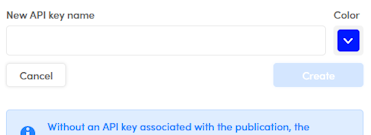
To create a new API key and link it to the workflow:
- Select Create new API key.
-
Enter the name of the key in New API key name, choose its color from the Color palette and select Create.
-
Copy the key value to the clipboard—possibly using the Copy key to clipboard
 button—then paste it and save it in a safe place.
-
-
When done with the API keys, select Next and complete the publishing wizard.
Monitor the workflow status
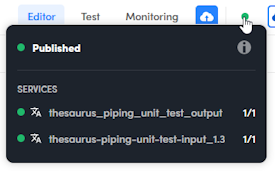
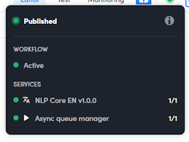
The publishing status of the workflow is represented by the colored dot in the main toolbar, to the right of Publish.
The gray color means that the workflow is not published; for the explanation of the other colors read below.
To have summary information about the publishing operation, hover over the colored dot.
To toggle the display of detail information, select the Show more or Show less  .
.
Synchronous workflow
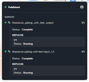
An orange dot means the workflow is being published but it's still not usable because non all of the software service corresponding to the building blocks have been turned on.

In the information pop-up, the dot beside a service that is not still on is red.
In case of a workflows with multi-replica blocks, the dot is yellow when the workflow is being published but is already usable because at least one replica of every service has been turned on.

In this case also the dot beside the name service that has been partially turned on is yellow.
When all the services are fully on, the dot becomes green.
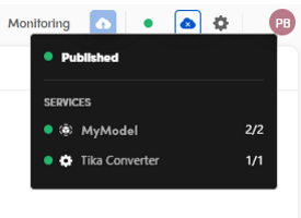
In the information pop-up all the services' dots are green too.
Asynchronous workflow
The color of the dot that represents the publication status of an asynchronous workflow becomes green, and surrounded by smaller dots, shortly after having requested the publication.
This to indicate that it is already possible to submit analysis tasks whatever the status of the workflow services is.
If you open the information pop-up you can see the status of the actual workflow, i.e. its readiness to process analysis tasks, corresponding to the situation of its services. The colors must be interpreted exactly as for a synchronous workflow, with the difference that it is still possible to submit analysis tasks, but these will actually be processed only when the color of the workflow is yellow or green.
So if the workflow is orange, it is inactive because all of its services are off (red).
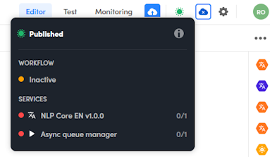
The services will be turned on based on the autoscaling parameters chosen when publishing.
If the workflow is yellow, it means it can process queued tasks because at least one replica of each of its services is on.
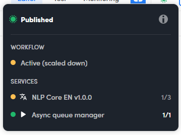
In this case the workflow is active but scaled down because it is not at its full processing capacity. It looks like this because either a scale down or a scale up operation is in progress, also based on autoscaling parameters.
When the workflow is at full capacity, its dot in the information pop-up is green, as are those of all its services, indicating that all replicas are on.
Re-publish
If you change a published workflow, a notification appears in the main toolbar, suggesting to update the published version.

Unpublish the workflow
To unpublish the workflow from the editor, select Unpublish  on the main toolbar.
You can also use the Workflows view of the main dashboard to unpublish workflows.
Download the Postman collection
To download a Postman collection with which you can test a published workflow through the NL Flow API, select the ellipsis to the right of the canvas toolbar and choose Download Postman collection.
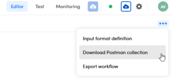
Once you have imported the collection into Postman, set collection variable API_KEY with the value of one of the API key linked with the published workflow. You can find more information about workflow-key association in the description of the Runtime view of the main dashboard of the NL Flow app.
Export the workflow
To export the workflow, save it and select the ellipsis to the right of the canvas toolbar then choose Export workflow.
The procedure creates and downloads to your computer a file with the .wfpk extension which contains the workflow definition and all non-standard components. For example, if the workflow contains blocks corresponding to symbolic or ML models, these will be included in the file, while processors, operators and knowledge models will only be referenced in the definition. This can make a big difference in file size.
The .wfpk files can be used to import the workflow into another NL Flow installation.
Upload a model
To upload a new model, select the upload icon  at the bottom of the My Model bar to the right of the page. The Upload model dialog appears.

Inside the dialog:
- Select the model type.
- Select Browse files and locate the previously exported file.
- Enter the model name.
- Select Upload.
Info
The maximum allowed file size is 4GB.
It is also possible to upload a model in the Models view of the main dashboard of the NL Flow app.
Customize the UI
Left panel
The left panel can be hidden to have more space for the drawing canvas. In order to be hidden, the left panel must first be undocked.
To undock the left panel select the undock button  inside the panel.
To hide the left panel:
- If the panel is docked, undock it (see above).
- Select the blue X button
 on the canvas toolbar.
To unhide the left panel select the blue plus button  on the canvas toolbar.
To dock the left panel, select the dock button  inside the panel.
My Models bar
The My Models bar on the right side of the page lists the most recently used models so that they can be quickly reused. The bar can the turned off to have more space in the canvas or if not needed.
To turn off the bar select the ellipsis to the right of the canvas toolbar then choose Show "My Models" bar. Repeat to turn the bar on again.